The Art of iPhone Notification Management: An In-Depth Exploration
In the fascinating world of iPhone technology, individualization, and user preference are key. The iPhone’s versatile operating system, iOS 16, has revolutionized how users interact with their notifications, accommodating various preferences, habits, and styles. Whether you’re the type of user who thrives on constant updates, finds solace in minimizing alerts, or seeks a tailored balance, Apple provides a range of options to personalize your notification experience.

Categorizing iPhone Users Based on Notification Preferences
In the sphere of iPhone users, we can broadly categorize users into three distinct categories, each defined by their relationship with lock screen notifications.
First, we have those who live for updates, who must see every alert, every notification at every moment. They revel in the continuous stream of information, deriving satisfaction from the perpetual connection with their digital world.
Second, we have the polar opposites – those who wish for tranquility, which would somewhat be disconnected from the digital chatter than be inundated with constant alerts.
And third, we have the pragmatists, who strike a balance between constant connection and peaceful disconnection. These users prefer to customize their iOS settings to create a notification system that matches their personal preferences, and thankfully, Apple provides the necessary tools to cater to these diverse needs.
Apple’s Three-tiered Approach to iPhone Notifications
The beauty of Apple’s design philosophy is reflected in its three-tiered approach to iPhone notifications, each accommodating the categories of users described above. This feature was unveiled with the launch of iOS 16, which changed the location of alerts to the bottom of the display and prioritized space for widgets through enhanced lock screen customization.
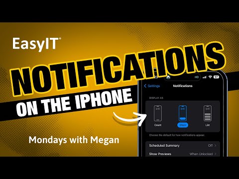
To navigate this new world of notifications, begin by opening your phone’s Settings app and tapping on Notifications. You’ll discover three images under the Display As heading representing your alert display options: Count, Stack, or List.
1. Count: The Minimalist’s Choice
The Count option caters to lovers of minimalism. Selecting Count positions your notifications at the bottom of your screen, nestled neatly between the flashlight and camera shortcuts. Here, they manifest as a simple line of text, such as “3 Notifications.” A mere tap or upward swipe expands them, catering to the needs of users who prefer simplicity and order.
2. Stack: The Default Selection
If you’ve never ventured into these settings, your iPhone will have defaulted to Stack. This option amasses your notifications near the bottom of your screen, compactly stacked one on the other. While these alerts don’t compress into a single line of text, they are densely arranged. You can expand these notifications by tapping them or swiping upwards to glean more information.
3. List: The Maximalist’s Delight
The List format is the boldest of all options. Choosing List presents your notifications as individual alert bubbles, with the most recent ones at the top. With an influx of alerts, the bubbles may begin to overlap slightly. This option is the most screen real estate-intensive, but it’s the perfect choice for those who like to see each notification distinctly.
Understanding iPhone Lock Screen Notification Options
No matter which format you choose, your notifications initially appear as bubbles at the bottom of your screen, each featuring the app name and a preview of the notification, provided you’ve granted iOS permission to display it. If you prefer to keep the content private until you unlock your phone, a more generic display, like “51 text messages” or “notification,” will show.
Once your notifications remain unattended for a few minutes, they morph into your pre-selected format.
Interestingly, you can fluidly transition between these three formats on your lock screen. The setting you choose primarily determines how your alerts accumulate when you’re not actively engaging with your phone. For instance, if you opted for the List format, you could swipe down to compress your notifications into a Stack and swipe down again to condense them into a Count. This transition is reversible, and an additional upward swipe after the List format reveals the Notification Center, where all pending alerts are displayed. A simple downward swipe can restore your chosen format if this becomes overwhelming.
Conclusion
Customizing your iPhone’s notification settings offers an added layer of control over your digital interactions, allowing you to tailor your experience to suit your preferences. Whether you align with the Count, Stack, or List camp, Apple’s innovative notification management system enables you to personalize your lock screen, managing the flow of information in a manner that suits your lifestyle.
So, take a moment to explore these settings, experiment with the options, and create a system that echoes your unique relationship with digital communication. After all, your iPhone should adapt to you, not vice versa.


